Dialog widgets
This section gives an overview of the available widgets. If the code examples given in this section are not intuitive to you, you might want to take a look into Executing dialogs.
Determining the widget attributes
Note
The widget attributes are documented below. Additionally, information about any widget can be obtained by accessing its __doc__ string.
#
# Query __doc__ attribute of a button widget
#
print (DIALOG.my_button.__doc__)
# output:
# Handle for a widget called 'my_button' of type 'Button' (button::pushbutton)
#
# Attributes:
# name             (string)              - Name of the widget. The name can be used to access the widget via a dialog handle.
# tooltip          (string)              - Tooltip of the widget. If empty, no tooltip is displayed.
# enabled          (boolean)             - Enabled state of the widget. Default is 'enabled', set to false for disabling it.
# value            (unspecified/various) - The current value of the widget. Type depends on the widget type and can be 'none' for empty widgets.
# attributes       (map)                 - Map of all accessible widget attributes together with their current values.
# focus            (boolean)             - Focus state of the widget. Can be used to set an explicit widget focus.
# text             (string)              - Text of the button
# type             (string)              - Button type ('push', 'toggle')
# icon             (Tom::Parse::Binary)  - Icon of the button
# icon_file_name   (string)              - Source file name of the icon
# icon_size        (string)              - Icon size mode (icon, full)
# icon_type        (string)              - Icon type (none, system, file)
# icon_system_type (string)              - System icon type (ok, cancel, arrow_up, arrow_down, arrow_left, arrow_right)
# icon_system_size (string)              - System icon size (default, large, extra_large)
Dialog window control
Control widget
Note
Each dialog window has a Control widget, which contains the ok / cancel or similar buttons of the dialog.
The control elements of a dialog cannot be configured like other dialog widgets.
Therefore, their name is fixed and they are grouped together inside of the control widget named control.
The control elements consist of the dialogs lower buttons plus a configurable dialog status label.
Handle |
Property |
Example |
|---|---|---|
DIALOG.control |
Control widget |
- |
DIALOG.control.status |
Status icon of the control widget |
DIALOG.control.status = ‘Point 1 missing’ |
DIALOG.control.<button> |
Handle for a button of the control widget |
DIALOG.control.ok.enabled = False |
Control widget elements
Note
The names of the Control widget elements are fixed.
Usually, the names are corresponding with the elements’ semantics. For example, the name of the ok button is ‘ok’. The names can also be obtained from the
__doc__string as shown in the code example below.The control elements are accessed like all other widget attributes.
# Print control widget properties<br>print (DIALOG.control.__doc__)
ControlGroup

Attributes:

status (string)              - Status tool tip icon
ok     (unspecified/various) - Control widget
cancel (unspecified/various) - Control widget
Status label
Hint
The Status label of the control widget is invisible until a status text is set.
If a status text is set, a small warning icon appears, like in regular applications’ dialogs.
The status label can be configured using its properties like all other widgets.
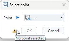
DIALOG=gom.script.sys.create_user_defined_dialog (file='dialog.gdlg')

# Set status label text
DIALOG.control.status = 'No point selected.'

# Set 'ok' button to disabled<br>DIALOG.control.ok.enabled = False
gom.script.sys.show_user_defined_dialog(dialog = DIALOG)
You can reset the status icon and clear the error message by assigning an empty string (DIALOG.control.status = '').
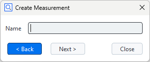
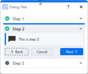
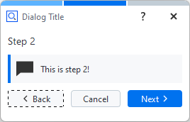
Wizards
Wizards are dialogs with < Back and Next > buttons at the lower dialog edge.
The script programmer is responsible for adding functionality to this layout.
Wizards are not very versatile, but modifying the displayed texts and images is easily possible.
Warning
It is not possible to exchange widgets from within a dialog after the dialog has been created!
Therefore Wizards only have simple options like exchange of images and texts in those containing elements.
Control widgets
The operational elements in a control widget from a wizard are acting like those in regular dialogs und can be accessed via handles as well:
#
# Create dialog with wizard control panel
#
DIALOG=gom.script.sys.create_user_defined_dialog (file='dialog.gdlg')
#
# Handler function to be registered to the dialog
#
def func (widget):
    #
    # Handle clicks onto the 'prev' button
    #
    if widget == DIALOG.control.prev:
        # Here you would write code to display the content of the previous wizard 'page'

        #
        # Handle clicks onto the 'next' button
        #
        print("Prev button was clicked.")
    elif widget == DIALOG.control.next:
        # Here you would write code to display the content of the next wizard 'page'

        #
        # Update dialog button enabled state and register handler function
        #
        print("Next button was clicked.")

DIALOG.handler = func

#
# Execute wizard dialog
#
RESULT=gom.script.sys.show_user_defined_dialog (dialog=DIALOG)
Creating wizard dialogs shows some ways to manage wizard dialogs in greater detail.
Common widget attributes
The following attributes are common to all widgets listed in the following sections:
- name (string)
Name of the widget. The name can be used to access the widget via a dialog handle.
- tooltip (string)
Tooltip of the widget. If empty, no tooltip is displayed.
- enabled (boolean)
Enabled state of the widget. Default is ‘enabled’, set to false for disabling it.
- value (unspecified/various)
The current value of the widget. Type depends on the widget type and can be ‘none’ for empty widgets.
- attributes (map)
Map of all accessible widget attributes together with their current values.
- focus (boolean)
Focus state of the widget. Can be used to set an explicit widget focus.
- visible (boolean)
Visible state of the widget. Default is ‘visible’, set to false for setting it invisible.
- handler (unspecified/various)
Individual event handler of the widget. If empty or no valid function, the dialog event handler is called instead. See Executing dialogs – Event handler functions.
Example
DIALOG=gom.script.sys.create_user_defined_dialog (file='dialog.gdlg')

#
# Event handler function called if anything happens inside of the dialog
#
def dialog_event_handler (widget):
	if widget == 'initialize':
		DIALOG.input.tooltip = 'Enter distance in mm'
		DIALOG.control.ok.enabled = False
	if widget == DIALOG.input:
        print(f"'{widget.name}' widget event")
		if DIALOG.input.value > 0:
			DIALOG.control.ok.enabled = True

DIALOG.handler = dialog_event_handler

RESULT=gom.script.sys.show_user_defined_dialog (dialog=DIALOG)
Output
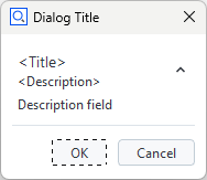
Description field (label) widget
The Description field (label) widget allows to display static text. It is typically used for labelling a section or an individual element of a dialog.
- text (string)
Label text
- word_wrap (boolean)
Word wrap
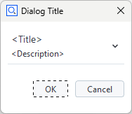
Continuous text widget
The Continuous text widget allows to display static text and keywords. A double click onto a text field widget opens the content editor. Some formatting can be applied.
- text (string)
Continuous text widget contents
- word_wrap (boolean)
Word wrap
- default_font_family (string)
Default font name
- default_font_size (integer)
Default font size
DIALOG.text = "How to become a professional metrologist"
DIALOG.text.default_font = 'Arial Black'
DIALOG.text.default_font_size = 16
Editor |
Dialog |
|---|---|
|
|
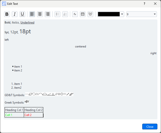
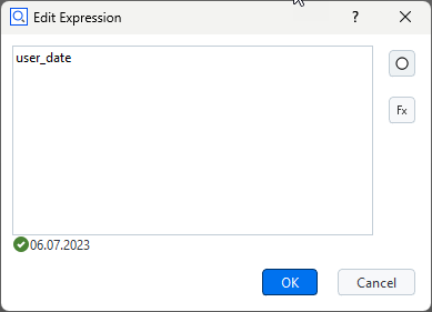
Displaying keywords in a continuous text widget
A keyword can be inserted into the text with the following procedure:
RMB ► ‘Insert Expression…’
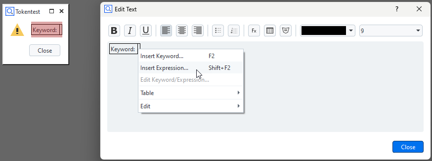
Select ‘Insert Keyword’ button
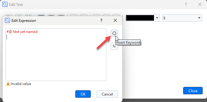
Select the desired keyword from the tree
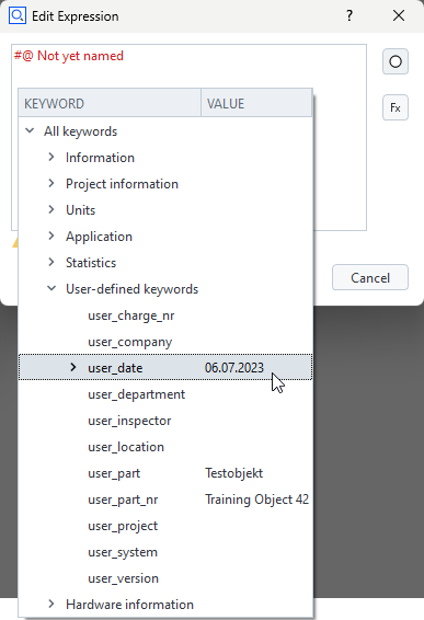
The keyword and its actual value are shown
Hint
The comment ‘#@ Not yet named’ should be deleted, otherwise the selected keyword ‘Date’ will not be shown in the editor.
The final rendering of the text widget
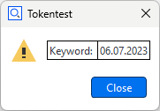
Internal representation of a dialog with text widget
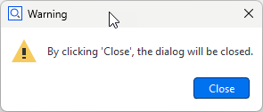
The dialog is stored as a JSON document internally.
gom.script.sys.execute_user_defined_dialog (dialog={
    "content": [
        [
            {
                ...
            },
            {
                "columns": 1,
                "default_font_family": "",
                "default_font_size": 0,
                "name": "text",
                "rows": 1,
                "text": {
                    "id": "",
                    "text": "\<html\>\<p align=\"center\"\>By clicking 'Close', the dialog will be closed.\</p\>\</html\>",
                    "translatable": True
                },
                                ...
                "type": "display::text",
                "wordwrap": False
            }
        ]
    ],
    "control": {
        "id": "Close"
    },
        ...
})
Image widget
The Image widget allows to display arbitrary images.
- use_system_image (bool)
Use system image instead of a user defined custom image
- system_image (string)
Name of the system image to display. Valid names are: ‘system_message_information’, ‘system_message_warning’, ‘system_message_critical’, ‘system_message_question’.
- data (QImage)
Custom image data to be displayed
- file_name (string)
Source file name of the image (read-only)
- keep_original_size (boolean)
Keep original image size (read-only)
- keep_aspect (boolean)
Keep original image aspect ratio (read-only)
- width (integer)
Image width (read-only)
- height (integer)
Image height (read-only)
Note that you can switch from a system image to a user image using the property use_system_image. But this user image must have been selected beforehand in the designer. You cannot read a new image file by setting the filename property. Also, all of the image formatting properties (keep_original_size, keep_aspect, width, height) only work in the designer. From the script you can only read these values. Although you cannot read images using the filename property you can copy images from one dialog to another using the data property. So you are able to prepare (create) a dialog as an image container holding several images. You can then use this image container dialog to copy the image you need to an actually displayed dialog.
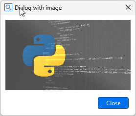
Internal representation of a dialog with image widget
The dialog is stored as a JSON document internally. The ‘data’ element contains the image data.
# The 'data' element contains the image data (shortened version here)
RESULT=gom.script.sys.execute_user_defined_dialog (dialog={
    "content": [
        [
            {
                "columns": 1,
                "data": "AAAAAYlQTkcNChoKAAAADUlIRFIAAAQAAAACQAgCAAAAnPeDgptZSsdt...",
                "file_name": "C:/Users/IQMPRINK/Downloads/zeiss-inspect_python.jpg",
                "height": 144,
                "keep_aspect": True,
                "keep_original_size": False,
                "name": "image",
                "rows": 1,
                "system_image": "system_message_information",
                "tooltip": {
                    "id": "",
                    "text": "",
                    "translatable": True
                },
                "type": "image",
                "use_system_image": False,
                "width": 256
            }
        ]
    ],
    "control": {
        "id": "Close"
    },
    "embedding": "always_toplevel",
    "position": "automatic",
    "size": {
        "height": 233,
        "width": 292
    },
    "sizemode": "automatic",
    "style": "",
    "title": {
        "id": "",
        "text": "Dialog with image",
        "translatable": True
    }
})
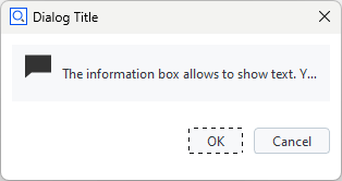
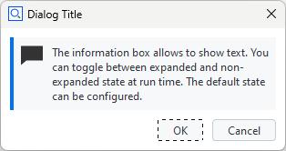
Information box widget
Collapsed
Expanded
The Information box widget allows to show text. You can toggle between expanded and collapsed state at run time. The default state can be configured.
- text (string)
Information text
- expanded (boolean)
Initial expanded state
Log widget
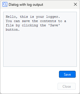
The Log widget can display multiple lines of unformatted text, which can be easily saved to a text file by clicking the save button.
- text (string)
Log text
- word_wrap (boolean)
Wrap log text
- show_save (boolean)
Show save button
- save_dialog_title (string)
Title of the save dialog
- scroll_automatically (boolean)
Scroll to end of text when new lines are added
- monospace (boolean)
Use monospace font
Progress bar widget
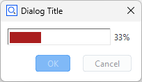
The Progress bar widget can be used in the two modes system and manual.
- value (integer)
Current value
- minimum (integer)
Minimum value
- maximum (integer)
Maximum value
- parts (integer)
Progress bar parts
- step (integer)
Current progress bar step
- text (string)
Progress bar text mode (none, percentage, step)
- mode (string)
Progress bar mode (system, manual)
- Manual mode
In this mode, the user may set the progress bar through its
valuevariable.Progress bar widget example – manual modeimport gom, time DIALOG=gom.script.sys.create_user_defined_dialog (file='dialog.gdlg') DIALOG.progress.minimum = 0 DIALOG.progress.maximum = 100 gom.script.sys.open_user_defined_dialog( dialog = DIALOG ) DIALOG.progress.value = 0 time.sleep(1) DIALOG.progress.value = 33 time.sleep(1) DIALOG.progress.value = 66 time.sleep(1) DIALOG.progress.value = 100 gom.script.sys.close_user_defined_dialog (dialog=DIALOG)
- System mode
In this mode, the progress bar displays the same progress information as the progress bar in the lower right corner of the software.
Progress bar widget example – system modeimport gom DIALOG=gom.script.sys.create_user_defined_dialog (file='dialog.gdlg') gom.script.sys.open_user_defined_dialog (dialog=DIALOG) gom.script.sys.create_project () gom.script.sys.import_project (file='some project') gom.script.sys.close_user_defined_dialog (dialog=DIALOG)
You can switch between automatic and manual mode from within the script by setting the mode variable as shown below:
# manual mode:
DIALOG.progress.mode = "manual"

# system mode:
DIALOG.progress.mode = "system"
- Partially controlled system progress bar
The range of a system progress bar can be divided into parts, sequentially controlled by an executed command.
The progress bar range can be split into multiple parts.
Each part controls an equally sized progress bar interval. If, for example, there are 3 parts, the first part ranges from 0 to 33, the second from 33 to 66 and the third from 66 to 100.
When a command is executed, the command controls just the one active part of the progress bar widget.
Progress bar consisting of multiple parts# -*- coding: utf-8 -*- import gom # Create a user defined dialog with a progress bar, mode 'system' DIALOG=gom.script.sys.create_user_defined_dialog (file='dialog.gdlg') gom.script.sys.open_user_defined_dialog( dialog = DIALOG ) # Split progress bar into 3 parts DIALOG.progress.parts = 3 # Current part is the first interval (part '0', because we are counting from '0') DIALOG.progress.step = 0 # Execute load command. The command will control the first progress bar range from 0% to 33%. # That means when the command has been finished, the progress bar will display '33%'. gom.script.sys.load_project (file='some project') # Current part is the second interval. The progress bar runs from 33% to 66% DIALOG.progress.step = 1 gom.script.sys.switch_to_report_workspace () gom.script.report.update_report_page ( pages=gom.app.project.reports, switch_alignment=True, switch_stage=False) # Current part is the third interval. The progress bar runs from 66% to 100% DIALOG.progress.step = 2 gom.script.sys.switch_to_inspection_workspace () gom.script.sys.recalculate_all_elements ()
Note
It is possible to switch between system and manual mode for each part.
Input
Integer widget
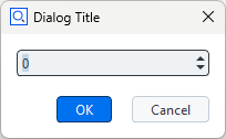
The Integer widget is used to request an integer value from the user. integerWidget is the object name of the integer widget in the example below.
- value (integer)
The current input value
- minimum (double)
Minimum possible value
- maximum (double)
Maximum possible value
RESULT=gom.script.sys.execute_user_defined_dialog (file='dialog.gdlg')
userInput = RESULT.integerWidget
Decimal widget
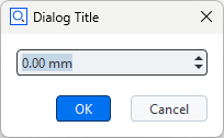
The Decimal widget is used to request a floating point value from the user. It is possible to choose the number of digits and a unit. The selectable units are the ones from the user preferences (Edit > Application > Settings > Preferences) in the Default units tab. decimalWidget is the object name of the decimal widget in the example below.
- value (double)
The current input value
- minimum (double)
Minimum possible value
- maximum (double)
Maximum possible value
- precision (double)
Value precision (number of decimals)
- unit (string)
Unit ID
- default_precision (boolean)
Use default precision
- background_style (string)
Style sheet based background color (red, green, blue)
RESULT=gom.script.sys.execute_user_defined_dialog (file='dialog.gdlg')
userInput = RESULT.decimalWidget
DIALOG.decimalWidget.precision = 2
DIALOG.decimalWidget.unit = 'LENGTH'
Hint
See Tech Guide: What are the Possibilities for Unit Conversions Usable in Scripts? for available units.
Text entry field
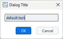
The Text entry field widget can be used to get string input from the user. A simple use case is given by the next code block. textEntryWidget is the object name of the widget in the example below.
- value (string)
The current input value
- read_only (boolean)
Read only
- password (boolean)
Password; hide input
- validator (function)
Input validator – input is accepted only if the validator function returns ‘True’
DIALOG=gom.script.sys.create_user_defined_dialog (file='dialog.gdlg')
DIALOG.textEntryWidget = "some default text"
RESULT = gom.script.sys.show_user_defined_dialog(dialog = DIALOG)
print( RESULT.textEntryWidget ) # the user input string
import re

# ...

# Accept only lowercase letters, digits & dash
def check_input(s):
	pattern = r'^[a-z0-9-]+$'
	return bool(re.fullmatch(pattern, s))

DIALOG.input.validator = check_input

# ...
Slider widget
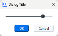
The Slider widget can be used to get a float value from a certain interval from the user. sliderWidget is the object name of the slider widget in the example below.
- value (double)
The current value
- minimum (double)
Minimum possible value
- maximum (double)
Maximum possible value
- precision (double)
Value precision (number of decimals)
- step (double)
Amount of increase/decrease with each step
- orientation (string)
Widget orientation (‘horizontal’ or ‘vertical’)
DIALOG=gom.script.sys.create_user_defined_dialog (file='dialog.gdlg')

RESULT = gom.script.sys.show_user_defined_dialog (dialog=DIALOG)
print( RESULT.sliderWidget ) # some text
Checkbox widget
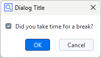
The Checkbox widget can be used to get boolean input from the user. checkboxWidget is the object name of the checkbox widget in the example below.
- value (boolean)
The current value
- title (string)
Title of the checkbox
- style (string)
Style of the checkbox
DIALOG=gom.script.sys.create_user_defined_dialog (file='dialog.gdlg')

RESULT=gom.script.sys.show_user_defined_dialog (dialog=DIALOG)
print (RESULT.checkboxWidget)
File widget
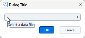
By clicking the File widget, a file selection dialog is opened. This allows to select a file from the file system.
- value (unspecified/various)
The current value of the widget
- file (string)
Selected file
- selection_type (string)
File selector type: ‘any’ (any file), ‘new’ (not an existing file), ‘file’ (an existing file), ‘multi_file’ (multiple existing files), ‘directory’ (an existing directory), ‘save_file’ (ask for confirmation before overwriting an existing file)
- title (string)
File selector dialog title
- default (string)
Default value
- limited (boolean)
Flag for limited file types
- file_types (list)
List of allowed file types; each list item must consist of
[<filename_extension>, <description>].limitedmust be set toTruein order to apply the filter!
Date widget
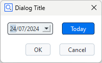
The Date widget requests a date from the user. dateWidget is the object name of the date widget in the example below.
- value (string):
The current value
- use_current_date (boolean)
Flag for initializing with default date
- default_date (QDate)
Default date
- year (integer)
Year
- month (integer)
Month
- day (integer)
Day
- show_today_button (boolean)
Show button for setting the current date
DIALOG=gom.script.sys.create_user_defined_dialog (file='dialog.gdlg')
dateObject = DIALOG.dateWidget.value # date object
print( DIALOG.dateWidget.year )  # integer
print( DIALOG.dateWidget.month ) # integer
print( DIALOG.dateWidget.day )   # integer
Color widget
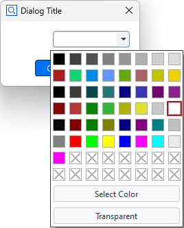
The Color widget allows to select a color. colorWidget is the object name of the color widget in the example below. gomColor behaves in the same way as gom.Color( ... ).
- value (object)
The current color value (gom.Color object)
- color (QColor)
The current selected color value (gom.Color object)
- transparency_allowed (boolean)
Transparency allowed
DIALOG=gom.script.sys.create_user_defined_dialog (file='dialog.gdlg')

#
# Event handler function called if anything happens inside of the dialog
#
def dialog_event_handler (widget):
    if widget == DIALOG.colorWidget:
        gomColor = DIALOG.colorWidget.color
        print( gomColor) # output: gom.Color (#ffffffff)

DIALOG.handler = dialog_event_handler

RESULT=gom.script.sys.show_user_defined_dialog (dialog=DIALOG)
print('Selection:', RESULT.colorWidget) # example output (white): 0xffffffff
Unit widget
The Unit widget allows to select a unit. unitWidget is the object name of the unit widget in the example below.
- value (string)
The current unit
Hint
See Tech Guide: What are the Possibilities for Unit Conversions Usable in Scripts? for available units.
DIALOG=gom.script.sys.create_user_defined_dialog (file='dialog.gdlg')

#
# Event handler function called if anything happens inside of the dialog
#
def dialog_event_handler (widget):
    if widget == DIALOG.unitWidget:
        unit = DIALOG.unitWidget.value
        print( unit) # ANGLE

DIALOG.handler = dialog_event_handler

RESULT=gom.script.sys.show_user_defined_dialog (dialog=DIALOG)
Element name widget
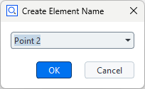
The Element name widget is used to request an element name from the user. It is possible to select the default name (according to naming scheme, e.g. ‘Point 2’ if ‘Point 1’ already exists), or to enter an arbitrary name. elementnameWidget is the object name of the element name widget in the example below.
- value (unspecified/various)
The current value
- basename (string)
Base name (e.g. ‘Point’)
- mode (string)
Mode to get the name suggestion from: (manually, from_element_type, check_like)
- read_only (boolean)
Read only
# Let the user define 3 new points (the coordinates are created automatically in this example)
for i in range(3):
    DIALOG=gom.script.sys.create_user_defined_dialog (dialog='dialog definition')

    #
    # Event handler function called if anything happens inside of the dialog
    #
    def dialog_event_handler (widget):
        pass

    DIALOG.handler = dialog_event_handler

    RESULT=gom.script.sys.show_user_defined_dialog (dialog=DIALOG)

    print (RESULT.elementnameWidget)

    MCAD_ELEMENT=gom.script.primitive.create_point (
        name=RESULT.elementnameWidget,
        point={'point': gom.Vec3d (i+10.0, 0.0, 0.0)}
    )
Selection
Split button widget
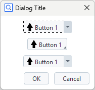
Three split button widgets with modes ‘menu’, ‘instant’ and ‘tool’, respectively.
The top widget has focus. The arrows are just examples for icons.
A split button is a hybrid between a button and an options menu. Each item consist of text and/or an icon. One of the modes ‘instant’, ‘menu’ or ‘tool’ can be configured.
- value (integer)
Index of pressed button
- items (list)
List of lists defining items [[string, base64]]
- texts (list)
List of texts for items [string]
- icons (list)
List of icons for items [base64]
- mode (string)
Button mode (‘instant’, ‘menu’, ‘tool’)
- ‘instant’ mode
You must open the menu to click a button. The initial button remains fixed.
- ‘menu’ mode
You can click the initial button immediately or open the menu to click any available button. The initial button remains fixed.
- ‘tool’ mode
You can click the initial button immediately or open the menu to click any available button. The initial button changes to the clicked button.
Toggle bar widget
The toggle bar widget allows to select one of several items. Each item consists of text and/or an icon.
- value (integer)
Index of selected item
- items (list)
List of lists defining items [[string, base64, string]]
- texts (list)
List of texts for items [string]
- icons (list)
List of icons for items [base64]
- tooltips (list)
List of tooltips for items [string]
- style (string)
Style of buttons (‘icon’, ‘text’, ‘icon_and_text’)
- mode (string)
Label mode for button group (‘no_label’, ‘label’)
Selection element widget

The Selection element widget can be used to select the elements from the element explorer. The following element types can be chosen:
Any Point
Point element
Line element
Plane element
Direction
User-defined
- value (special)
The current selected element. May also be
Nonefor user-definedfilteranduse_not_defined- supplier (string)
Type of elements handled by this widget (any, points, lines, planes, directions, coordinate_systems, custom)
- filter (function)
Element filter function for custom type element selector widgets
- fast_filter (function)
Faster element filter function for custom type element selector widgets. Switch expected filter function signature, bulk vs. single element:
True: List of elements → Iterable of boolsFalse: Single element → bool (default)
- use_not_defined (boolean)
Enable to initially show an empty choice for user-defined filter functions, i.e. like the other element types. (default: ‘False’)
elementSelectionWidget is the object name of the element selection widget in the example below.
DIALOG=gom.script.sys.execute_user_defined_dialog (dialog='dialog.gdlg')

selectedElement = DIALOG.elementSelectionWidget
print(selectedElement.value ) # output: gom.app.project.inspection['Equidistant Surface Points 1']
The following script shows how to use a custom filter for element selection. The example filter allows the user to select a system plane:
DIALOG4 = gom.script.sys.create_user_defined_dialog(file='dialog.gdlg')


def dialog_event_handler(widget):
    pass

# filter system planes
def element_filter(element) -> bool:
    try:
        if element.type == 'plane':
            return True
    except Exception as e:
        pass
    return False

DIALOG4.handler = dialog_event_handler
DIALOG4.input_new.filter = element_filter

# Alternative: use fast filtering
# from typing import Iterable
#
# def fast_element_filter(*elements) -> Iterable[bool]:
#     return [element_filter(e) for e in elements]
#
# DIALOG4.input_new.fast_filter = True
# DIALOG4.input_new.filter = fast_element_filter

RESULT = gom.script.sys.show_user_defined_dialog(dialog=DIALOG4)

print('Chosen system plane: ', RESULT.input_new.name)
Please find the complete example here: dialog_custom_elem_select.py
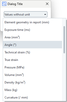
Selection list widget
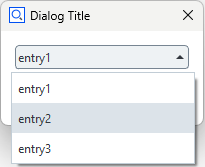
The Selection list widget allows to make a selection from a predefined set of options. The selected item can be accessed from a script through its object name (e.g. selectionListWidget) as follows.
- value (string)
The current value
- index (integer)
Index of selected list item
- items (list)
List of items
selectedValue = DIALOG.selectionListWidget.value
selectedIndex = DIALOG.selectionListWidget.index
print( selectedValue ) # output: entry2
print( selectedIndex ) # output: 1
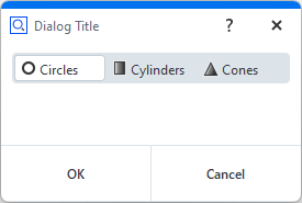
Combo box widget
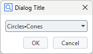
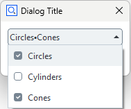
Selection in progress
The combo box allows to select multiple items from a list. Each item consists of text and data (represented as string).
- value (list)
List of selected items (data)
- items (list)
List of available items (display text, data)
# Assign a list of selected data items
DIALOG.shape_list.value = ['circles', 'cones']
Buttons
Button widget
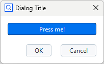
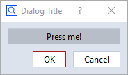
The Button widget allows to trigger an event or to return a boolean value, respectively. There are two types of buttons: push buttons and toggle buttons. The push button is a regular button and needs an event handler to manage its action. The toggle button has two states - active and inactive - and the user can toggle between them by clicking the button. The button is highlighted in active state as shown in the screenshot. The state of the toggle button can be accessed via the ‘value’ attribute.
- value (boolean)
The current button value (only useful for toggle button)
- text (string)
Text of the button
- button_type (string)
Button type (‘push’, ‘toggle’)
- icon (Tom::Parse::Binary)
Icon of the button
- icon_file_name (string)
Source file name of the icon
- icon_size (string)
Icon size mode (icon, full)
- icon_type (string)
Icon type (‘none’, ‘system’, ‘file’)
- icon_system_type (string)
System icon type (‘ok’, ‘cancel’, ‘warning’, ‘error’, ‘arrow_up’, ‘arrow_down’, ‘arrow_left’, ‘arrow_right’)
- icon_system_size (string):
System icon size (‘default’, ‘large’, ‘extra_large’)
toggleButtonState = DIALOG.toggleButtonWidget.value
print(toggleButtonState) # output: True
The buttons size and icon can be changed in the Dialog Editor.
Note
There are also values for file icons. These only work straightforward using the dialog designer but not from a script. You can only change between no icon and system icons in a straightforward way.
Radio button widget
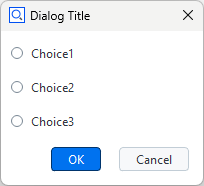
The Radio button widget enables the user to choose an option from a predefined set. Each option has a label and a unique ID, which both can be set in the scripting dialog editor by double clicking the widget. The IDs are ‘ONE’, ‘TWO’ and ‘THREE’ in the example below.
- value (string)
The current selected radio button. This can be
None.- items (list)
List of radio button items (data, display text), e.g.
DIALOG.radiobuttons.items = [['Value1', 'Title1'], ['Value2', 'Title2'], ['Value3', 'Title3']]- default (string)
Default enabled radio button, e.g.
DIALOG.radiobuttons.default = 'Value2'
selectedChoice = DIALOG.radiobuttonsWidget.value
print( selectedChoice ) # output: ONE

if selectedChoice == 'ONE':
    print("IDs are strings.") # output: IDs are strings.
Layout
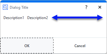
Separator line widget
The separator line widget provides a horizontal line with an optional title.
- title (string)
Separator title (optional)
Horizontal spacer widget
The horizontal spacer widget claims the space specified by ‘minimum_size’ and ‘maximum_size’. The actual widget is not visible.
- minimum_size (integer)
Minimum spacer size (default: 0)
- maximum_size (integer)
Maximum spacer size (default: -1, i.e. unlimited)
Vertical spacer widget
The vertical spacer claims the space specified by ‘minimum_size’ and ‘maximum_size’. The actual widget is not visible.
- minimum_size (integer)
Minimum spacer size (default: 0)
- maximum_size (integer)
Maximum spacer size (default: -1, i.e. unlimited)
Tab layout widget
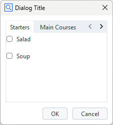
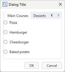
The Tab layout widget provides a configurable number of tabs. Each tab serves as container for any number and types of widgets.
- current_tab (integer)
Index of current tab
- tabs (list)
List of tab titles
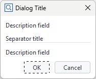
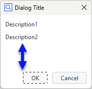
Separator layout widget
Collapsed
Expanded (contains a single description field widget)
The separator layout widget serves as a container for any number of widgets. Its contents can be collapsed or expanded. It provides title, description and icon as optional features.
- title (string)
Title text
- description (string)
Description text
- icon (string)
System icon or user icon imported from file. Icons are stored as base64-encoded strings.
- expanded (boolean)
True: Layout is initially expanded
Wizard widget
Wizard style: “List”
Wizard style: “Stack”
- Wizard widget
The wizard widget allows to create any number of wizard steps, which are completed sequentially. Advancing to the next step, skipping a step or branching to a specific step is only possible if a certain condition, which is defined in the dialog handler, is true. Each wizard step provides a dialog with any type and number of widgets.
current_id(integer)ID of current step
steps(list)List of step titles
Important
If a wizard step can be completed is controlled with the wizard object’s method step_set_complete(step_id, condition).
The condition must be a boolean value, which is typically computed from user input and/or project data.
E.g.: DIALOG.wizard.step_set_complete(DIALOG.wizard.current_id, DIALOG.user_age.value > 18)
import gom

DIALOG=gom.script.sys.create_user_defined_dialog (file='dialog.gdlg')

def dialog_event_handler (widget):
	if widget['type'] == 'initialized':
		DIALOG.wizard.step_set_complete(DIALOG.wizard.current_id, True)

DIALOG.wizard.handler = dialog_event_handler

gom.script.sys.show_user_defined_dialog (dialog=DIALOG)
See Wizard widget control for more features.
See also
The Wizard widget is commonly used in dialogs designed for the Workflow Assistant.
Other
Abort button widget
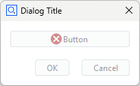
The Abort button widget aborts the current action. It is disabled if no action is currently executed. It behaves in the same manner as the abort button in the lower right corner of the ZEISS INSPECT software.

- text (string)
Text of the button
- button_type (string)
Button type (‘push’, ‘toggle’)
- icon (Tom::Parse::Binary)
Icon of the button
- icon_file_name (string)
Source file name of the icon
- icon_size (string)
Icon size mode (icon, full)
- icon_type (string)
Icon type (none, system, file)
- icon_system_type (string)
System icon type (ok, cancel, warning, error, arrow_up, arrow_down, arrow_left, arrow_right)
- icon_system_size (string)
System icon size (default, large, extra_large)
File system browser widget
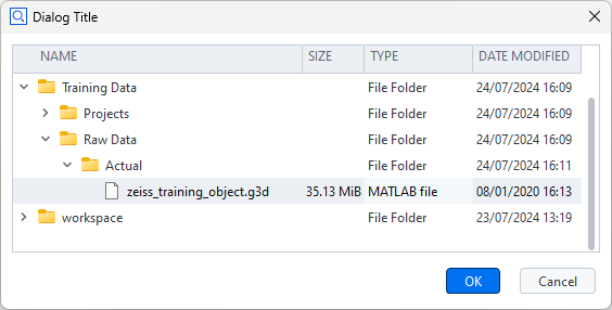
The File system browser widget allows to view the file system and to select a file or a set of files, respectively. A filter can be set to show only files with certain filename extensions.
- root (string)
File system root directory
- show_date (boolean)
Show file date column
- show_size (boolean)
Show file size column
- show_type (boolean)
Show file type column
- use_multiselection (boolean)
Single/multi file selection mode
- selected (list)
Selected files
- filter (list)
List of filename extensions to be shown
def dialog_handler(widget):
    if widget == 'initialize':
        DIALOG.filesystem.root = 'C:/temp'
        DIALOG.filesystem.use_multiselection = True
        filter = ['*.g3d', '*.stp']
    ...

DIALOG.handler = dialog_handler

RESULT = gom.script.sys.show_user_defined_dialog( dialog = DIALOG )

print(RESULT.filesystem.selected)
# E.g.:
# ['C:/temp/ZEISS_INSPECT_Training/Training Data/Raw Data/Actual/ZEISS Training Object Mesh 1.g3d', 'C:/temp/ZEISS_INSPECT_Training/Training Data/Raw Data/Actual/ZEISS Training Object Mesh 2.g3d']
File drag&drop area widget
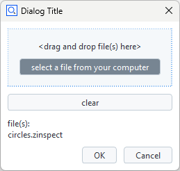
The File drag&drop area allows to select files. The widget shows the base names of the selected files, but stores the filenames with full paths internally. Some of its text items can be configured.
- text_area (string)
Default text of drop area (default: ‘<drag and drop file(s) here>’)
- text_hover (string)
Text shown when hovered with droppable file (default: ‘<drop file(s)>’)
- text_list (string)
Preamble text before filenames list (default: ‘file(s):’)
- max_length (string)
Maximum number of characters displayed for filenames (default: -1, i.e. unlimited)
Tolerances widget
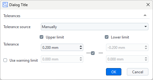
The Tolerances widget is a group of input widgets which allows to configure all parameters related to tolerances.
- expanded (boolean)
Widget is expanded
- mode (string)
Tolerance mode (‘no_tolerance’, ‘via_tolerance_table’, ‘from_cad’, ‘manual’, ‘from_element’)
- upper (double)
Upper limit
- lower (double)
Lower limit
- use_upper (boolean)
Use upper limit
- use_lower (boolean)
Use lower limit
- use_warn_limit (boolean)
Use warning level
- upper_warn (double)
Upper warn limit
- lower_warn (double)
Lower warn limit
- link_limits (boolean)
Link limits
- unit (string)
Unit ID
- additional_precision (integer)
Additional precision compared to default settings
Important
The Tolerances widget’s result data type depends on the input:
Symmetric upper/lower tolerance values: A single floating point value is returned.
Asymmetric upper/lower lolerance value or one-sided tolerance: A dictionary is returned.
Examples
Symmetric Tolerances
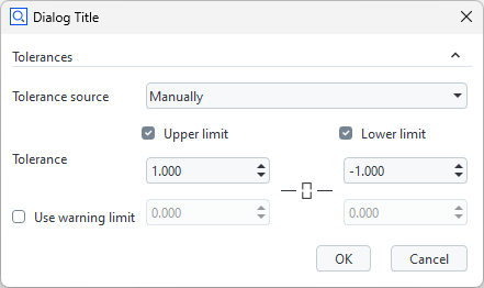
gom.dialog.DialogResult ('tolerances': 1.0)Asymmetric Tolerances
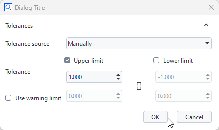
gom.dialog.DialogResult ('tolerances': {'lower': float ('nan'), 'tolerance_type': 'one_sided_under', 'upper': 1.0})One-sided Tolerance
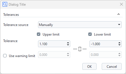
gom.dialog.DialogResult ('tolerances': {'lower': -1.0, 'tolerance_type': 'two_sided_center', 'upper': 1.1})
Hint
See Tech Guide: What are the Possibilities for Unit Conversions Usable in Scripts? for available units.
Widget text assignment and formatting at run time
The Description field (label) widget and the Continuous text widget support HTML / CSS syntax for text formatting and character encoding.
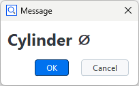
Example: Dialog with a label widget (label)
# Label - font size: 18 pt, style: bold, special character: 'Diameter'
DIALOG.label.text = '<span style="font-size:18pt"><b>Cylinder ⌀</b></span>'
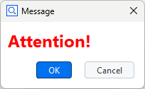
Example: Continuous text widget (cont_text) with formatted text
# Continuous text - font size: 18 pt, font weight: 600, color: red,
DIALOG.text.text = '<span style="font-size:18pt; font-weight:800; color:red;">Attention!</span>'
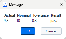
Example: Continuous text widget (cont_text) with a table containing values from variables
var1 = 9.8
var2 = 10
var3 = 0.3
var4 = "pass"

DIALOG.text.text = '<table width="200">'\
'<tr><th>Actual</th><th>Nominal</th><th>Tolerance</th><th>Result</th></tr>'\
f'<tr><td>{var1}</td><td>{var2}</td><td>{var3}</td><td>{var4}</td></tr></table>'
Note
In case a character string is not recognized as HTML code automatically, enclose it in <html> tags:
DIALOG.label.text = '<html>Diameter ⌀</html>'